First thing worth doing with any printed tee — turn it inside out. Collar ribbing, hem stitching, the seam down the side (or the missing seam — also information) and you’ve basically read the shirt before you’ve read the title. Tees run $70 to $79 across the pages at Tyler the Creator Merchandise, and that money covers two things discussed as one: a blank somebody bought by the box, and a print laid onto it.
Nobody prints on nothing.
The blank underneath
So the cotton in that shirt got spun one of two ways, which sounds like a detail nobody needs until you’ve owned a fuzzy tee that went pilly inside a month. Carded open-end yarn is the cheap route — short fibers poke up off the surface and the hand feels a bit dusty. Ring-spun gets twisted tighter, finer, smoother, so ink sits on top of it instead of sinking into fluff.
Weight comes next, in ounces per square yard, and the numbers are worth half-knowing. 4.2 oz is thin — fine for July in Atlanta, see-through under a bright ceiling light. Five to 5.3 is where most merch lands. Past six, it goes structural, which is also what lets a big front print sit flat instead of dragging the fabric out of shape.
Then the body. Tubular means knitted as one cylinder, no side seams, cheaper, and it tends to twist slightly after a few washes. Side-seamed is cut from panels and sewn, so it keeps something closer to a human shape. Double-needle hems are two rows of stitching where a cheap shirt has one — twice the thread, roughly twice the life before anything unravels.
Screen, ink, cure
Screen printing is how nearly all of it gets made, and it’s more mechanical than people picture. Roughly:
- Artwork gets split into layers, one per color.
- Each layer burns onto its own mesh screen coated in light-sensitive emulsion.
- Shirt goes flat on a platen, locked under screen one.
- A squeegee shoves ink through the open mesh.
- A flash unit sets that color just enough for the next to land on top.
- Then a tunnel around 320°F, where the ink cross-links and stops being water-soluble.
Four colors on the front means four screens, four passes, four alignments that all have to agree. Which is why a busy graphic costs more than one white hit, and why registration — whether those colors genuinely line up — is the first thing I’d look at when a package opens.
Ink changes the feel more than the cotton does, honestly. Plastisol sits on top as a thin plastic film, so a new tee can feel a bit stiff until it breaks in. Water-based and discharge inks soak into the fibers instead; you can barely find the print with your fingers, though the color reads softer. Puff rises off the surface under heat. Two shirts at the same weight can feel nothing alike.
Where the artwork lands, and why it moves
A standard front hit starts somewhere around two and a half, three inches under the collar seam, maybe eleven or twelve inches wide on a medium. Nobody measures it. But your eye does, and when a print sits half an inch low you’ll feel something is off without being able to name it.
This is the part that catches people. Screens usually don’t change size across the size run, because swapping them slows a press down, so one graphic built around a medium reads enormous on a small and floats up high and lonely on a 2XL. Wear a 3XL? Find a listing photo on a bigger model rather than assuming the print scales.
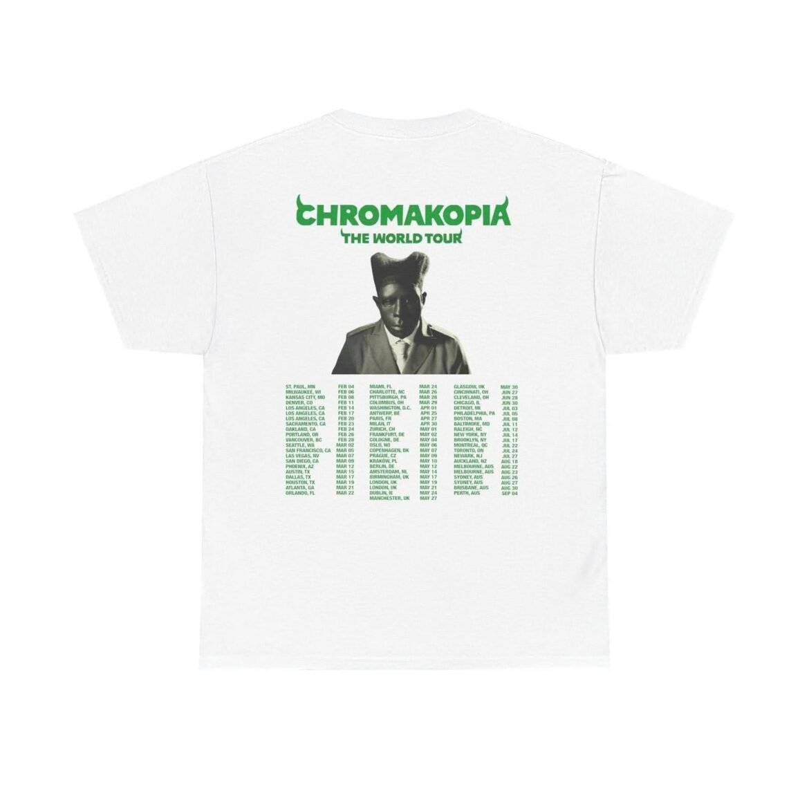
Back prints tend to run larger, sitting between the shoulder blades about where a backpack strap crosses. Sleeve hits, a small print at the nape, a tag down at the hem — quiet placements, cheap to add, and they’re what separates a tee that looks thought about from one that looks slapped together.
So what makes a tour tee a tour tee?
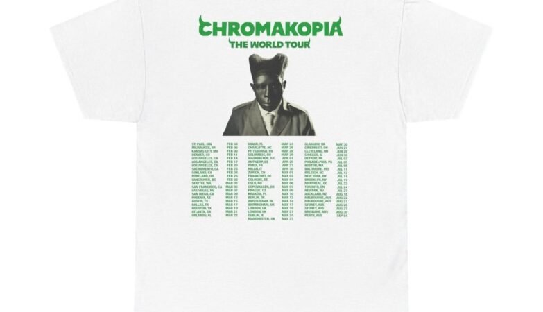
The front carries artwork from one album era — Chromakopia, Call Me If You Get Lost, IGOR, Flower Boy, Cherry Bomb — and the back is where the name gets earned. City and date lists stacked in a tall column, sometimes a leg name across the shoulders. That routing is the whole point. It pins the shirt to a specific run of nights instead of a season, which is why the back print matters more than the front here.
Artwork travels between garments too, and it doesn’t behave the same on each. Fleece has a looped face that eats thin lines, so a print built for flat jersey gets re-separated first — which is why a Chromakopia Hoodie usually carries a chunkier, bolder version of a graphic than the tee does. Same art. Different translation.
Checking one when the package opens
Give it five minutes before the tags come off. Stretch the print gently across its widest point — healthy ink flexes with the cotton and comes back, an under-cured print shows hairline cracks right there in your hands. Hold it to a window and look for a ghost of one color outside another.
- Pull the collar out an inch, let go, see whether it lies flat again.
- Thumb along the hem — one row of stitching, or two?
- Is the front graphic centered on the side seams or the collar label? Those aren’t always the same line.
Sizing lives on each product page as a chart, and the measurements matter more than the letter. Measure a tee you already like flat across the chest, compare, then go up if you want room for a hoodie underneath come October.
The print dies before the shirt does
Cotton outlasts ink nearly every time, and heat is what kills ink. Cold wash, around 85°F, inside out, mild detergent. Fabric softener coats the film and dulls it, so leave that out of the load. And ironing straight onto plastisol melts it in one pass, so press from the back if you press at all.
Skip the dryer. Seriously. Tumble heat turns a crisp edge into a cracked one, and a mid-weight tee on a hanger is dry in a few hours anyway. Black drifts toward charcoal eventually. White picks up a cream tint whatever you do. That’s cotton, not a fault.
Key Takeaways
|
Next time a tee page loads, scroll past the flat mockup. Look at the weight, look at how the body is put together, and look at where the graphic sits against the collar — those three answer most of what you’d want to know. And if one of the album prints has been sitting in an open tab all week, that’s what to check before you pick a size.