Your logo is the smallest piece of your brand and often the most hardworking. It sits on your website, signage, invoices, social profiles, packaging and uniforms, quietly telling people who you are before you say a word. A great logo is rarely a happy accident. It comes from clear thinking, careful drawing and a strong understanding of the business behind it. If you are researching logo design Melbourne, this guide breaks down what makes a logo work, how the design process unfolds and how to avoid the mistakes that leave businesses redesigning too soon.
What a Logo Is (and Is Not)
A logo is a visual identifier. It is not your entire brand. Your brand is the sum of every impression people have of your business, including service, tone of voice, pricing and reputation. The logo is the signature on that experience, a shorthand people can recognise at a glance.
A good logo should:
- Be memorable so people recall it after one look.
- Be distinct so it stands apart from competitors.
- Be appropriate to your audience and industry.
- Be flexible so it works at any size and on any surface.
- Be timeless enough to last years rather than months.
The Main Types of Logos
Understanding the options helps you choose a direction.
- Wordmarks spell out the business name in custom lettering. They suit names that are short and distinctive.
- Lettermarks (monograms) use initials. They work well for long or complex names.
- Symbols or icons use an image alone, though these usually work best once a brand is already well known.
- Combination marks pair a symbol with text. They are the most flexible and common choice for growing businesses.
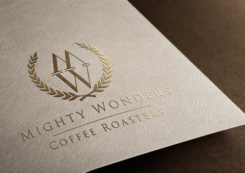
- Emblems place text inside a badge or crest, giving a traditional, crafted feeling.
- Mascots use a character to give the brand personality, ideal for friendly, family-oriented businesses.
The Design Process, Stage by Stage
Discovery
A designer starts by learning about you: your business, customers, competitors, values and goals. The more clearly you describe who you serve and what makes you different, the stronger the result.
Research
Good designers study your industry and surrounding landscape to avoid clichés and find gaps where your brand can stand out.
Sketching and Concepts
Ideas begin on paper or screen as rough concepts. Several directions are explored before one is refined.
Refinement
Chosen concepts are polished: shapes are balanced, spacing is adjusted and typography is tuned. Small details, such as the curve of a letter, make a big difference.
Colour and Typography
Colours carry emotion. Blue often suggests trust, green growth, red energy and black sophistication. Typefaces carry personality as well, from friendly rounded styles to crisp, authoritative serifs.
Testing
The logo is checked in black and white, at tiny sizes, on dark and light backgrounds and across real-world applications such as signage and social icons.
Delivery
You should receive a full set of files, along with usage guidance, so your logo stays consistent wherever it appears.
Files You Should Always Receive
- Vector files (such as SVG, EPS or AI) that scale to any size without losing quality.
- High-resolution PNGs with transparent backgrounds for web and digital use.
- JPGs for situations where transparency is not needed.
- PDF versions for printing and sharing.
- Colour variations, including full colour, one colour, white and black.
Make sure you own the final artwork and the rights to use it.
Common Logo Mistakes
- Too much detail. Complex logos fail when shrunk.
- Following trends blindly. Fashions fade quickly.
- Using stock imagery or templates. These are rarely unique and can create ownership problems.
- Too many fonts or colours. Simplicity is easier to remember.
- Ignoring versatility. A logo should look good on a business card and a billboard.
- Designing for yourself rather than your customers.
How to Brief a Designer
A clear brief saves time and improves results. Include:
- A summary of your business and what you offer.
- Your target audience.
- Your values and the personality you want to project.
- Examples of logos you like and dislike, and why.
- Where the logo will be used.
- Any colours or elements you want to include or avoid.
- Timeframe and budget.
Budget and Value
Logo prices range widely, from cheap templates to full branding programs. A very low price often means little research, generic concepts or limited rights. Remember the logo will appear thousands of times, so quality pays for itself. Ask what is included, how many concepts and revisions are offered, and whether brand guidelines are provided.
When to Refresh Your Logo
Businesses evolve, and sometimes the logo needs to keep up. Consider a refresh if:
- Your services or audience have changed significantly.
- The logo looks dated or outdated compared with competitors.
- It does not reproduce well on digital platforms.
- You are expanding into new markets.
A refresh often keeps the core recognisable elements while modernising details, preserving existing recognition.
Final Thoughts
A logo is a long-term business asset. Invest the time to understand your audience, work with a designer who asks smart questions and insist on a design that is simple, versatile and distinctive. A well-made mark will not just decorate your business. It will help build trust, recognition and loyalty for years to come.